
欢迎来到 WebGIS 入门系列的第十五篇文章!在本文中,我们将介绍在 WebGIS 开发中常用的数据可视化工具,包括一些热门的图表库和开源地图库。通过学习本文,您将了解到不同图表库和地图库的特点,并掌握它们的基本使用方法。
所有内容开始之前
不管是图表库的使用还是开源地图库的使用,在 WebGIS 开发甚至是软件开发领域,都可称之为“数据可视化”。在此系列中,预期将可视化的所有内容都放置在首页界面。
在 src/components 目录下新建 DataVisualization.vue 组件,并将下面代码拷贝其中:
<template>

  <div class="data-visualization"></div>
</template>

<script setup lang="ts"></script>

<style scoped>
  .data-visualization {
    width: 100%;
    height: 100%;
  }
</style>
优化调整 src/views 目录下的 HomeView.vue 组件代码,将新建的 DataVisualization 组件引入其中:
<template>

  <main class="visual-main">    <DataVisualization />  </main>
</template>

<script setup lang="ts">
  import DataVisualization from "@/components/DataVisualization.vue"
</script>

<style>
  .visual-main {
    width: 100%;
    height: 100%;
  }
</style>
此时界面应该是空白,因为 DataVisualization 组件中未添加内容。接下来我们所有的图表及开源地图都会按需添加至此组件,欢迎继续阅读!
图表库的使用
1、ECharts
Apache ECharts 是一个基于 JavaScript 的开源可视化库,它提供了丰富的图表类型和交互功能,适用于各种数据可视化场景。
我们可以通过以下方式来使用它:
1、使用之前通过命令 npm install echarts 安装;
2、在 src/components 目录下新建 EChartsChart.vue 组件,并将下面代码拷贝其中:
<template>

  <div id="EChart" class="echarts-chart"></div>
</template>

<script setup lang="ts">
  import { onMounted } from "vue"
  import * as echarts from "echarts"

  function initChart() {
    // 获取渲染图表的 dom,决定着要将图表渲染到哪个 dom 上
    const myChart = echarts.init(document.getElementById("EChart")) // 图表配置
    myChart.setOption({
      title: {
        text: "ECharts 柱状图示例",
      },
      tooltip: {},
      xAxis: {
        data: ["类别一", "类别二", "类别三", "类别四", "类别五", "类别六"],
      },
      yAxis: {},
      series: [
        {
          name: "当前类别数量",
          type: "bar",
          data: [5, 20, 36, 10, 10, 20],
        },
      ],
    })
  }

  onMounted(() => {
    initChart()
  })
</script>

<style scoped>
  .echarts-chart {
    width: 400px;
    height: 300px;
  }
</style>
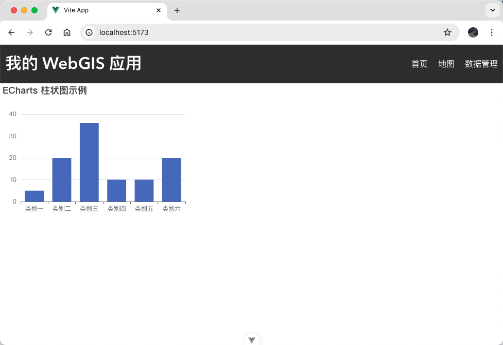
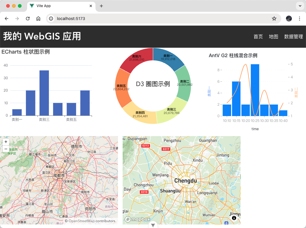
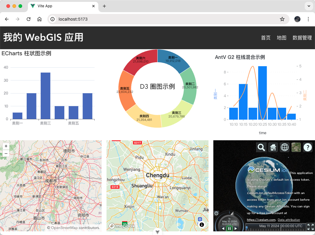
3、将 EChartsChart 组件引入 DataVisualization 组件,此时界面会看到一个通过 ECharts 图表库渲染的柱状图:
2、D3
d3.js 是一个数据驱动的文档操作库,它可以帮助您使用数据创建动态、交互式的图表。虽然学习曲线较陡,但它提供了极大的灵活性,可以实现各种独特的可视化效果。
我们可以通过以下方式来使用它:
1、使用之前通过命令 npm install d3 安装;
2、在 src/components 目录下新建 D3Chart.vue 组件,并将下面代码拷贝其中:
<template>

  <div id="d3Chart" class="d3-chart"></div>
</template>

<script setup lang="ts">
  import { onMounted } from "vue"
  import * as d3 from "d3"

  const data = [
    { name: "类别一", value: 19912018 },
    { name: "类别二", value: 20501982 },
    { name: "类别三", value: 20679786 },
    { name: "类别四", value: 21354481 },
    { name: "类别五", value: 22604232 },
    { name: "类别六", value: 21698010 },
  ]

  function initChart() {
    const chartDom = document.getElementById("d3Chart")
    const width = chartDom?.style.width ? parseInt(chartDom.style.width) : 400
    const height = chartDom?.style.height
      ? parseInt(chartDom.style.height)
      : 300
    const radius = Math.min(width, height) / 2

    const arc = d3
      .arc()
      .innerRadius(radius * 0.67)
      .outerRadius(radius - 1)

    const pie = d3
      .pie()
      .padAngle(1 / radius)
      .sort(null)
      .value((d) => d.value)

    const color = d3
      .scaleOrdinal()
      .domain(data.map((d) => d.name))
      .range(
        d3
          .quantize((t) => d3.interpolateSpectral(t * 0.8 + 0.1), data.length)
          .reverse()
      )

    const svg = d3
      .create("svg")
      .attr("width", width)
      .attr("height", height)
      .attr("viewBox", [-width / 2, -height / 2, width, height])
      .attr("style", "max-width: 100%; height: auto;")

    svg
      .append("text")
      .attr("x", 0)
      .attr("y", 0)
      .attr("text-anchor", "middle")
      .attr("font-size", "1.5em")
      .text("D3 圈图示例")

    svg
      .append("g")
      .selectAll()
      .data(pie(data))
      .join("path")
      .attr("fill", (d) => color(d.data.name))
      .attr("d", arc)
      .append("title")
      .text((d) => `${d.data.name}: ${d.data.value.toLocaleString()}`)

    svg
      .append("g")
      .attr("font-family", "sans-serif")
      .attr("font-size", 12)
      .attr("text-anchor", "middle")
      .selectAll()
      .data(pie(data))
      .join("text")
      .attr("transform", (d) => `translate(${arc.centroid(d)})`)
      .call((text) =>
        text
          .append("tspan")
          .attr("y", "-0.4em")
          .attr("font-weight", "bold")
          .text((d) => d.data.name)
      )
      .call((text) =>
        text
          .filter((d) => d.endAngle - d.startAngle > 0.25)
          .append("tspan")
          .attr("x", 0)
          .attr("y", "0.7em")
          .attr("fill-opacity", 0.7)
          .text((d) => d.data.value.toLocaleString("en-US"))
      )
    d3.select("#d3Chart").append(() => svg.node())
  }

  onMounted(() => {
    initChart()
  })
</script>

<style scoped>
  .d3-chart {
    width: 400px;
    height: 300px;
  }
</style>
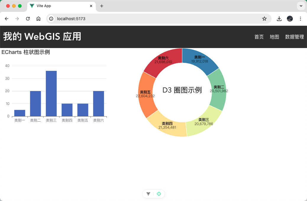
将 D3Chart 组件引入到 DataVisualization 组件,此时界面上可以看到一个通过 D3.js 图表库绘制的圈图:
3、AntV
AntV 是一款由阿里巴巴前端团队开发的开源数据可视化库。它基于 JavaScript 语言,提供了丰富的图表和图形组件,可以帮助用户轻松地将数据转化为可视化图表。
AntV 并不特指某一个图表库,而是 G2(统计图表)、S2(多维表格)、G6(关系图)、X6(流程图)、L7(地图)、F2(移动统计图)、F6(移动关系图)、F7(移动地图)这些单一图表库的统称,所以在使用时按需安装各个图表库即可。
我们可以通过以下方式来使用 G2(其余图表库类似):
1、使用之前通过命令 npm install @antv/g2 安装;
2、在 src/components 目录下新建 AntVChart.vue 组件,并将下面代码拷贝其中:
<template>

  <div id="antvChart" class="antv-chart"></div>
</template>

<script setup lang="ts">
  import { onMounted } from "vue"
  import { Chart } from "@antv/g2"

  const data = [
    { time: "10:10", call: 4, waiting: 2, people: 2 },
    { time: "10:15", call: 2, waiting: 6, people: 3 },
    { time: "10:20", call: 13, waiting: 2, people: 5 },
    { time: "10:25", call: 9, waiting: 9, people: 1 },
    { time: "10:30", call: 5, waiting: 2, people: 3 },
    { time: "10:35", call: 8, waiting: 2, people: 1 },
    { time: "10:40", call: 13, waiting: 1, people: 2 },
  ]

  function initChart() {
    const chart = new Chart({
      container: "antvChart",
      autoFit: true,
      title: "AntV G2 柱线混合示例",
    })

    chart.data(data)

    chart
      .interval()
      .encode("x", "time")
      .encode("y", "waiting")
      .axis("y", { title: "类别一", titleFill: "#5B8FF9" })

    chart
      .line()
      .encode("x", "time")
      .encode("y", "people")
      .encode("shape", "smooth")
      .style("stroke", "#fdae6b")
      .style("lineWidth", 2)
      .scale("y", { independent: true })
      .axis("y", {
        position: "right",
        grid: null,
        title: "类别二",
        titleFill: "#fdae6b",
      })

    chart.render()
  }

  onMounted(() => {
    initChart()
  })
</script>

<style scoped>
  .antv-chart {
    width: 400px;
    height: 300px;
  }
</style>
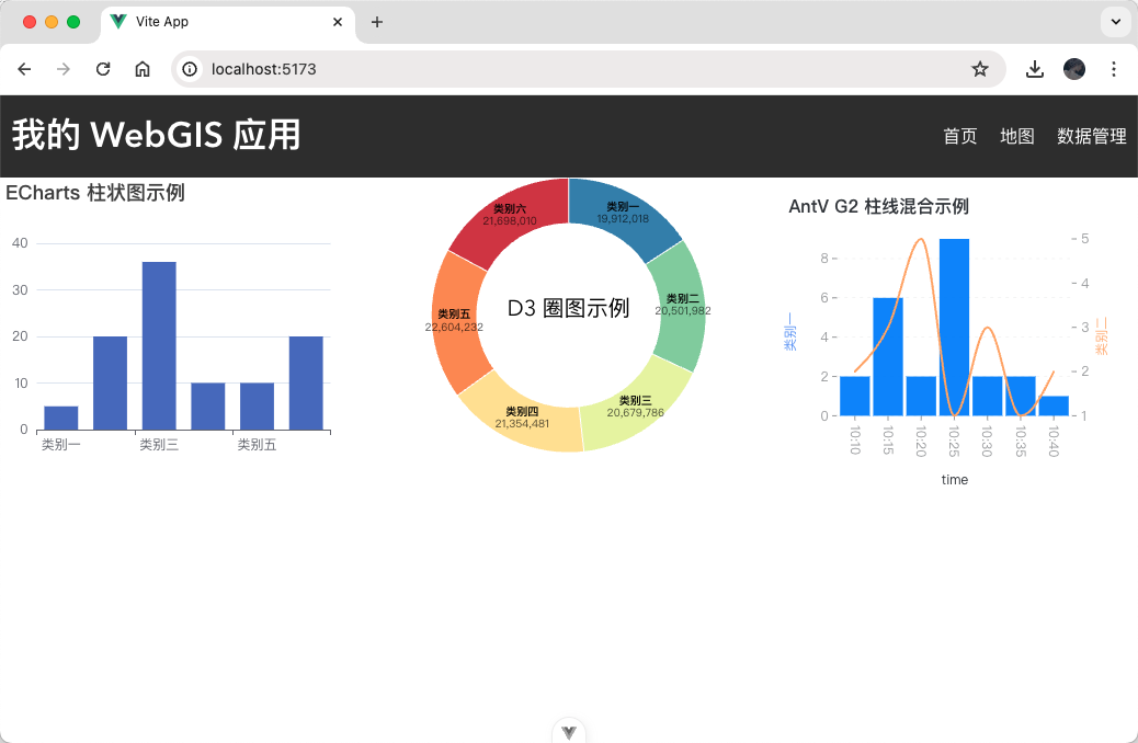
3、将 AntVChart 组件引入到 DataVisualization 组件,此时界面上可以看到一个通过 AntV G2 图表库绘制的柱线混合图表:
开源地图库的使用
1、OpenLayers
OpenLayers 是一个模块化、高性能、功能丰富的库,用于显示地图、与地图和地理空间数据进行交互。该库内置支持广泛的商业和免费图像和矢量瓦片源,以及最流行的开放和专有矢量数据格式。借助 OpenLayers 的地图投影支持,数据可以处于任何投影中。
我们可以通过以下方式来使用它:
1、使用之前通过命令 npm install ol 安装;
2、在 src/components 目录下新建 OpenLayersMap.vue 组件,并将下面代码拷贝其中:
<template>

  <div id="map" class="open-layer-map"></div>
</template>

<script setup lang="ts">
  import { onMounted } from "vue"
  import Map from "ol/Map.js"
  import OSM from "ol/source/OSM.js"
  import TileLayer from "ol/layer/Tile.js"
  import View from "ol/View.js"
  import { transform } from "ol/proj"
  import "ol/ol.css"

  function initMap() {
    const map = new Map({
      target: "map",
      layers: [
        new TileLayer({
          source: new OSM(),
        }),
      ],
      view: new View({
        center: transform([104.061982, 30.577203], "EPSG:4326", "EPSG:3857"),
        zoom: 8,
      }),
    })
  }

  onMounted(() => {
    initMap()
  })
</script>

<style scoped>
  .open-layer-map {
    width: 400px;
    height: 300px;
  }
</style>
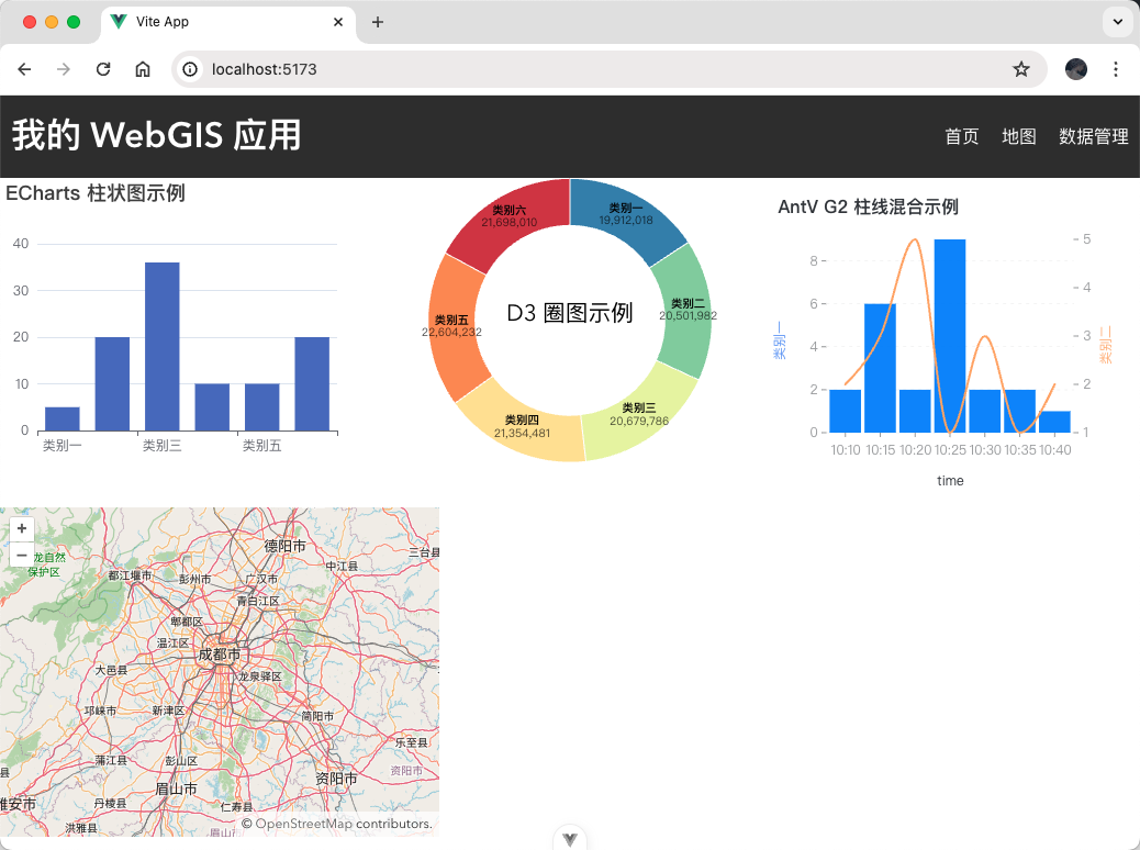
3、将 OpenLayersMap 组件引入到 DataVisualization 组件,此时界面上可以看到一个通过 OpenLayers 地图库绘制的地图:
2、Mapbox
Mapbox GL JS 是一个用于构建 Web 地图和 Web 应用程序的客户端 JavaScript 库,利用 Mapbox 的现代地图技术。您可以使用 Mapbox GL JS 在 Web 浏览器或客户端中显示 Mapbox 地图、添加用户交互,并在您的应用程序中自定义地图体验。
我们可以通过以下方式来使用它:
1、使用之前通过命令 npm install mapbox-gl 安装;
2、在 src/components 目录下新建 MapboxMap.vue 组件,并将下面代码拷贝其中:
<template>

  <div id="mapbox" class="map-box-map"></div>
</template>

<script setup lang="ts">
  import { onMounted } from "vue"
  import mapboxgl from "mapbox-gl"
  import "mapbox-gl/dist/mapbox-gl.css"

  function initMap() {
    mapboxgl.accessToken = "申请的 token"
    const map = new mapboxgl.Map({
      container: "mapbox",
      style: "mapbox://styles/mapbox/streets-v12",
      center: [104.061982, 30.577203],
      zoom: 8,
    })
  }

  onMounted(() => {
    initMap()
  })
</script>

<style scoped>
  .map-box-map {
    width: 400px;
    height: 300px;
  }
</style>
3、将 MapboxMap 组件引入到 DataVisualization 组件,此时界面上可以看到一个通过 Mapbox 地图库绘制的地图:
3、Cesium
CesiumJS 是一个开源的 JavaScript 库,用于创建世界一流的 3D 球体和地图,具有最佳性能、精度、视觉质量和易用性。来自各个行业的开发人员,从航空航天到智慧城市再到无人机,都使用 CesiumJS 创建交互式 Web 应用程序,用于共享动态地理空间数据。
我们可以通过以下方式来使用它:
1、使用之前通过命令 npm install cesium 安装;
2、在 src/components 目录下新建 CesiumMap.vue 组件,并将下面代码拷贝其中:
<template>

  <div id="cesium" class="cesium-map"></div>
</template>

<script setup lang="ts">
  import { onMounted } from "vue"
  import { TileMapServiceImageryProvider, Viewer } from "cesium"
  import "cesium/Build/CesiumUnminified/Widgets/widgets.css"

  window.CESIUM_BASE_URL = "node_modules/cesium/Build/CesiumUnminified/"

  function initMap() {
    const view = new Viewer("cesium", {
      imageryProvider: new TileMapServiceImageryProvider({
        url: "node_modules/cesium/Build/CesiumUnminified/Assets/Textures/NaturalEarthII",
      }),
    })
  }

  onMounted(() => {
    initMap()
  })
</script>

<style scoped>
  .cesium-map {
    width: 400px;
    height: 300px;
  }
</style>
3、将 CesiumMap 组件引入到 DataVisualization 组件,此时界面上可以看到一个通过 Cesium 地图库绘制的地图:
小作业:选择地图库并实现图表可视化
现在,让我们来尝试一个小作业。您可以选择一个开源地图库,并结合一个图表库,例如 ECharts 或 D3.js,实现一个简单的 WebGIS 大屏应用,例如:根据地图上的某些数据,绘制柱状图、折线图、饼状图、热力图等图表显示其统计信息。网页布局设计可参考下图:

结语
通过本文的学习,您已经了解了在 WebGIS 开发中常用的数据可视化工具,包括图表库和开源地图库。这些工具能够帮助您更好地展示地理空间数据和统计信息,为用户提供更丰富的数据展示和分析功能。 希望本文能够为您在 WebGIS 数据可视化方面的学习和应用提供一定的帮助,并且启发您进一步探索 WebGIS 开发的世界。祝您在 WebGIS 开发的旅程中取得成功!